All the tools you need, in one app.
Replacing many manual tools.
Until eOceans, teams needed multiple tools—and countless hours—to get the job done.
We put everything in one place.

eOceans has two core components:
Mobile App:
Designed for field teams to track activities and log observations offline. Once uploaded, eOceans automatically streams the data to all relevant projects, ensuring seamless integration and real-time updates.
Dashboard:
Built for project owners to simplify project management, streamline team coordination, visualize data, ensure quality control, and effortlessly generate reports—all in one place.


Built for teamwork
Invite your team—scientists, rangers, guardians, colleagues, fishers, observers, field staff, the public, and more—to contribute data to your project. As they do, the results come to life in your dashboard.
Core features:
Mobile app for in-field data collection, collaboration.
With eOceans, your team and everyone around the world can now collect data in the field in a standardised, interoperable way — enabling you to quickly work across projects, teams, and organisations. Work offline, upload when ready, and eOceans syncs to all connected projects. No duplicating efforts. No delays.

Then, data are compiled at the scale you need.
Managing data across projects, organisations, and places is complex. With eOceans, just define your area—local or global—and the platform automatically processes and analyses everything to fit. No hassle. Full consistency.

Your data are automatically visualised:
-
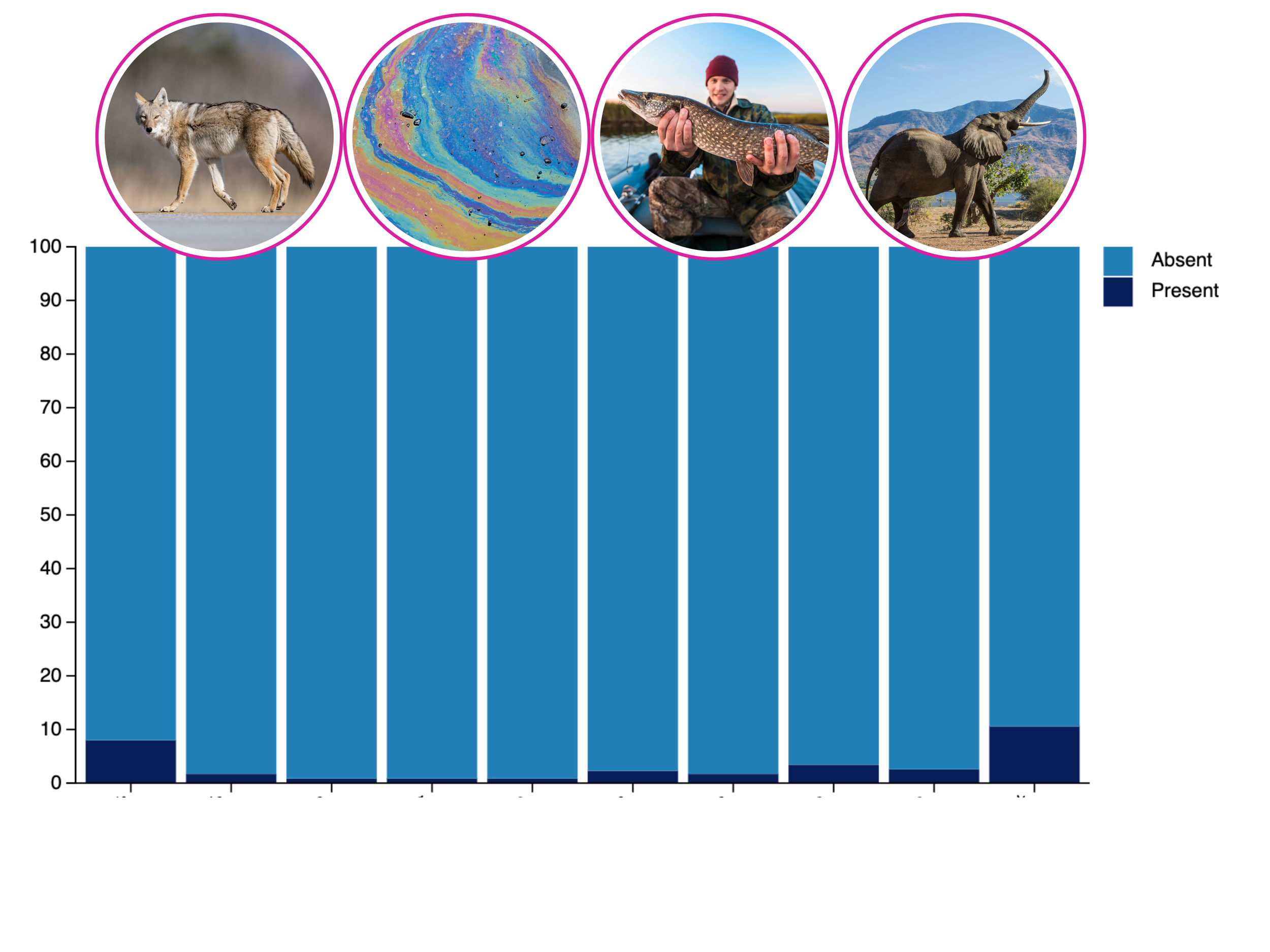
![Bar chart showing the presence and absence of various wildlife in a habitat, including a wolf, a colorful abstract pattern, a person holding a fish, and an elephant in the background.]()
Presence, Absence & Frequency
Are key species, activities, or threats present?
Examples: Species, pollution, disease outbreaks, fish kills, human activities.
Uses: Fisheries, tourism operators, health officials, vessel operators, environmental monitors.
-
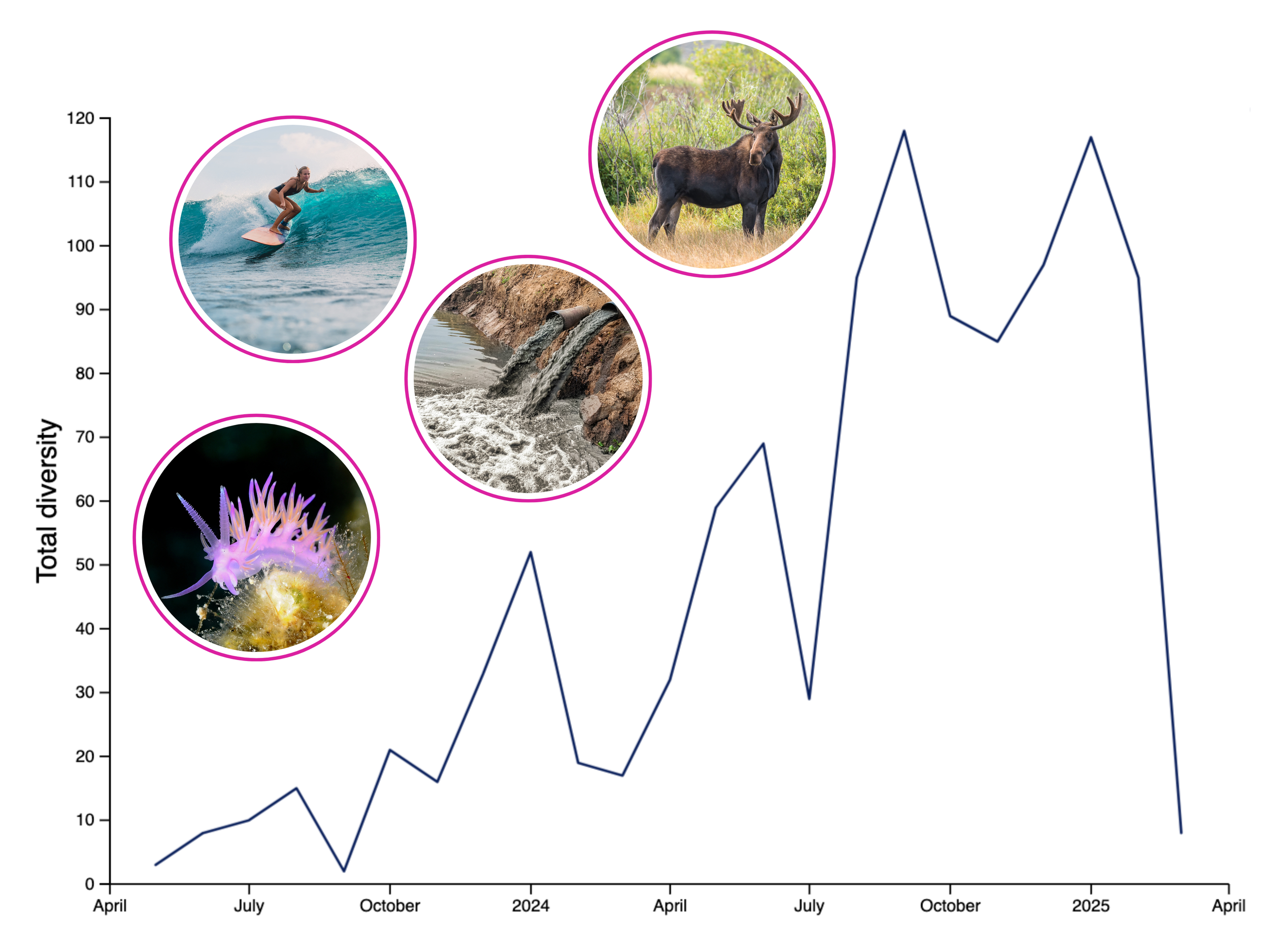
![A line graph showing total biodiversity over time, with significant increases at certain points. Overlaying the graph are five circular images bordered in purple: a woman surfing on a wave, a moose in a grassy area, waterfalls in a river, a purple sea slug on coral, and a mountain landscape.]()
Temporal Trends
What’s changing over time—daily, weekly, seasonally?
Examples: Fish/animal abundance, movements and migrations, invasive species, pollution, diseases.
Uses: Fisheries, conservation, epidemiology, supply chain analysts.
-
![Illustration of a whale breaching out of the ocean, with a photo of the whale jumping from the water encased in a pink circle overlay.]()
Spatial distribution
Where are species, activities, pollutants, diseases?
Examples: Endangered species, bycatch, pollution, ghost nets, invasive species.
Uses: Shipping companies, ecotourism, enforcement, aquaculture, public health.
-
![Scientific table summarizing biological data, including total observations, tracks, targets, counts, and species information with images of a sea turtle, dolphins, a bison, and a hippopotamus.]()
Effort-normalised metrics
Effort-based indicators like Catch Per Unit Effort (CPUE).
Examples: Catch and bycatch, wildlife by park rangers or scientists.
Uses: Fisheries, scientists, wildlife and protected area managers.
-
![A map of Laamu Atoll showcasing surrounding marine life, including a sea turtle, manta rays, a shark, a starfish, and a fish, with each species highlighted in circular inset images.]()
Hotspot & Risk mapping
Where are concentrations of risks or opportunities?
Examples: Whale strike zones, illegal fishing/hunting, disease outbreaks, fish kills.
Uses: Scientists, managers, decision makers, shipping, enforcement, aquaculture, climate monitoring.
-
![A hand holding a smartphone shows a social media app with a photo of an African wild dog. The screen displays various icons and a heart icon with a green checkmark indicating validation.]()
Data quality & validation
Are reports consistent and accurate?
Examples: Misidentified species, data gaps, incorrect methodologies.
Uses: Scientists, NGOs, policymakers, environmental impact assessments, logistics and trade analysts.
-
![A circular diagram showing the classification of marine animals, with photos of a shark, starfish, seal, and squid around the circle.]()
Diversity analysis
What’s the variety of species, activities, and threats?
Examples: Species richness, types of pollutants, range of human uses or cultural values.
Uses: Conservation, management, planners, economists, investors, public health, and community leaders.
-
![Laptop screen displaying a spreadsheet with colorful rows and columns, a person's hand typing on the keyboard, and five circular images of various outdoor scenes and animals floating above the laptop, including a boat on water, a lion, sailboats, a rescue boat with people, and a dolphin.]()
Clean Outputs
Are results clean, consistent, and ready for use?
Examples: Validated, interoperable spreadsheets, scalable analysis, and data sharing.
Uses: Scientists, NGOs, governments, industries, data managers, and consultants.


Data Downloads. Magic Uploads™.
Managing data from multiple sources is slow, messy, and costly. eOceans changes that. With automated tools like Magic Uploads™ and Data Downloads, you get clean, standardized datasets—instantly integrated and always up to date—saving you time, money, and headaches. With Magic Uploads™, your data comes to life the moment you upload it.

Track all your key metrics.
Tracking key metrics over time and space is slow, costly, and prone to error. eOceans simplifies this by automatically measuring survey effort, biodiversity, social values, threats, engagement, and more—so you can stay on track, save time, and deliver results.

Onboarding your team, made simple.
Inconsistent onboarding across data collection teams creates messy data and unreliable results. eOceans solves this with built-in onboarding tools—upload instructions in images, video, or text so every team member stays aligned from day one. No matter when or where they join, your team is able to collect high-quality, consistent data folo

Minimize errors, maximize usability.
Manual data entry is error-prone and messy. eOceans fixes that—automatically standardizing formats and fields to deliver clean, error-free, interoperable datasets. Your data is ready to use, analyze, and share—without the cleanup.

Data quality.
eOceans minimizes errors from the start with built-in quality control tools, such as:
In-App Field Guide for instant species info, making identification quick and accurate.
ID Please for team collaboration, ensuring correct species and observation identification.
Quality Check for real-time data validation with check, caution, and X markers, enabling on-the-go error correction.

Ocean Ledger™ and Global Biodiversity Ledger™
By choosing to send your data to the Ocean Ledger™ and Global Biodiversity Ledger™ you instantly unlock the power of collaboration. This feature aggregates data from participating projects worldwide, giving a real-time snapshot of biodiversity health at a global scale.

Launch your project — in under an hour.
i) Fill out a short form and ii) purchase your project—Your project will then be available in both the dashboard and mobile application.

Setting up a project is as simple as filling out THIS form:

Then, add data.
Depending on your project needs, data can stream into your project in 3 ways:
Mobile app – Capture and add data directly to your project via the eOceans mobile app
**Collect data offline, in the field. Upload the data when connected. eOceans automatically shares data to all projects it needs to go to.
Spreadsheet uploads – Upload existing data to your project using our Magic Uploads™ feature.
Sensors or data streams – We can build custom APIs to stream data directly to your project.

